Library Web Experience

Library Web Experience

A case study on redesigning a seamless digital experience for Vienna's Public Libraries

A case study on redesigning a seamless digital experience for Vienna's Public Libraries

PROJECT OVERVIEW

PROJECT OVERVIEW

Design Challenge, Solution and Process Overview

Design Challenge, Solution and Process Overview

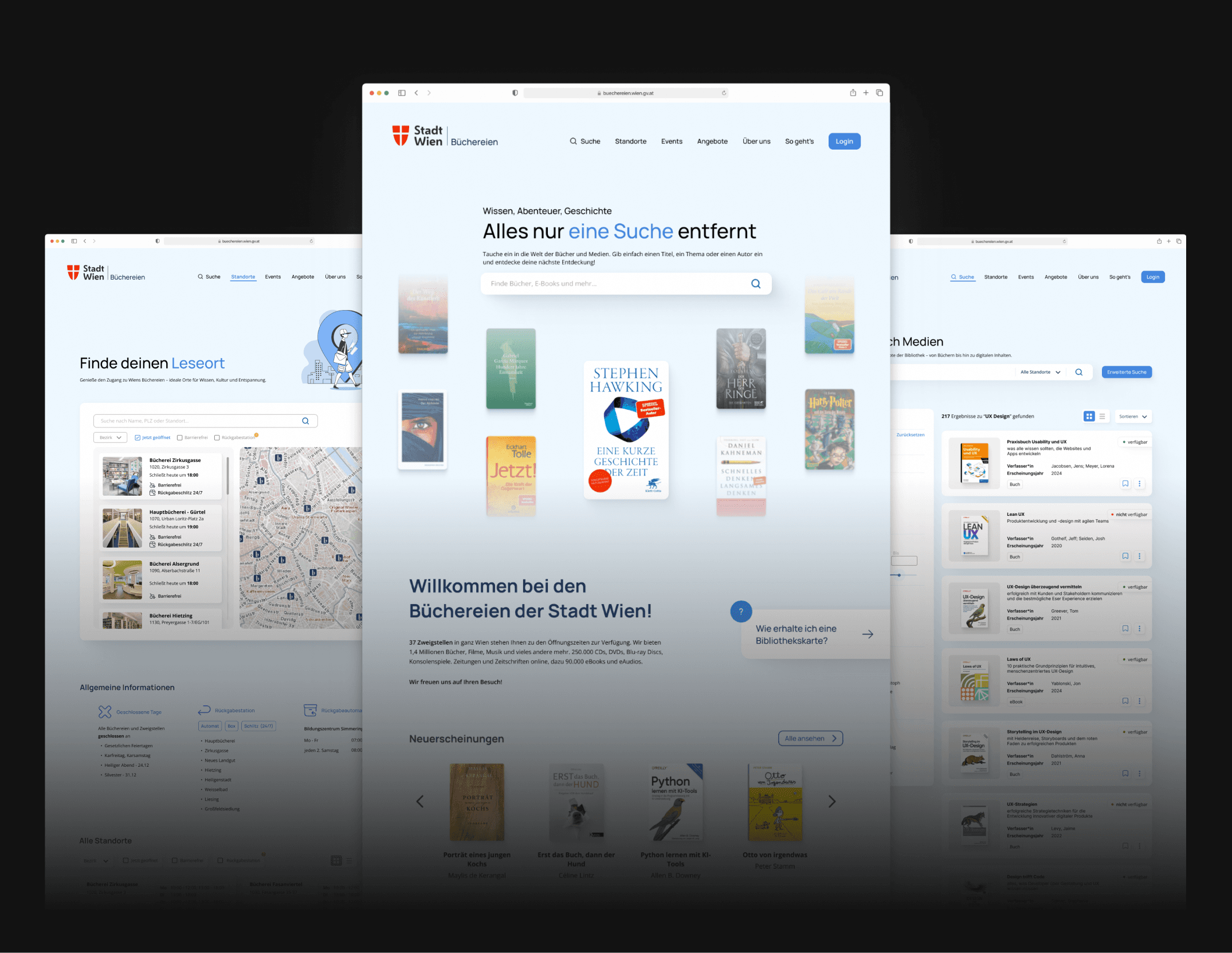
The revamped Vienna public libraries website brings a fresh, modern twist to the library experience! With a sleek design and intuitive features, it makes browsing, finding, and borrowing books easier and more enjoyable than ever before.

Challenge

Challenge

The challenge for this project came from years of firsthand frustration. From school to university, navigating the Vienna libraries’ website was always a struggle - confusing layout, poor search, and an overall clunky experience.

Years later, now stepping into the shoes of a UX designer, I returned to the library website in search of UX literature - and was hit with déjà vu. The same frustrations from my school and university days were still there: a confusing layout, clunky search, and an experience that felt anything but user-friendly. But this time, instead of clicking away, I saw an opportunity. This wasn’t just about refreshing a website - it was about transforming a resource meant to empower curious minds. The challenge? Reimagine the experience from the ground up and finally make it as helpful, intuitive, and engaging as it always should’ve been.

Solution

Solution

The solution? A complete redesign focused on clarity, simplicity, and ease of use. Backed by UX research, I set out to transform the outdated, clunky interface into a modern, intuitive experience where users can quickly find what they need - without the guesswork. From students to researchers, the goal was to strengthen the overall UX, turning a clunky site into a smooth, intuitive journey. Alongside usability, I refreshed the visual design to feel current, clean, and trustworthy - because good design should work and look the part.

The solution? A complete redesign focused on clarity, simplicity, and ease of use. Backed by UX research, I set out to transform the outdated, clunky interface into a modern, intuitive experience where users can quickly find what they need - without the guesswork. From students to researchers, the goal was to strengthen the overall UX, turning a clunky site into a smooth, intuitive journey. Alongside usability, I refreshed the visual design to feel current, clean, and trustworthy - because good design should work and look the part.

Scope

  • Effortless media search: books, magazines, eBooks, audiobooks, and more – all easy to find

  • Quick access to library info: locations, opening hours, and available services at a glance

  • Revamped UI and UX: a cleaner, more intuitive design with a focus on the landing page

  • Engaging offers and events: highlighting programs, workshops, and cultural happenings in an accessible way

Timeline

Timeline

February 2025 - March 2025

February 2025 - March 2025

Responsibilities

Responsibilities

UX Research

Visual Design

Product Design

UX Research

Visual Design

Product Design

Tools

Tools

Figma

FigJam

Google Workspace
Notion

Figma

FigJam

Google Workspace
Notion

The Process

The Process

1

1

Research

Research

Expert Insights

Competitive Analysis

Online Survey

Expert Insights

Competitive Analysis

Online Survey

2

2

Define

Define

Affinity Diagram

HMW (How Might We)

Affinity Diagram

HMW (How Might We)

3

3

Ideation

Ideation

Low Fidelity

Mid Fidelity

High Fidelity

Low Fidelity

Mid Fidelity

High Fidelity

4

4

Final Steps

Final Steps

Final Thoughts

Final Thoughts

RESEARCH

RESEARCH

Expert Insights

Expert Insights

As the first step in my redesign process, conducting an expert review of the current library website was essential to understand its existing flaws and identify key usability issues. By stepping into the shoes of a user, I conducted a comprehensive site walkthrough, assessing everything from navigation to content clarity. This allowed me to pinpoint pain points that would hinder a smooth user experience. I leveraged my background as a UX designer to analyze the site through an expert lens, ensuring that I highlighted the most critical issues that needed to be addressed to set a solid foundation for the redesign. This review not only informed the design process but also helped me focus on areas that would have the most impact on improving the user experience.

Here are some usability issues I identified during the initial review:

Lack of clear structure and hierarchy
The interface feels cluttered, with no clear visual guidance or focus areas. Important elements get lost in the noise


Inconsistent navigation
Multiple menu types and navigation layouts confuse users and disrupt the browsing flow, making it hard to know where you are or how to go back


Poor accessibility and contrast
Excessive use of red on white fails contrast standards, making content hard to read for many users, especially those with visual impairments


Outdated and monotonous design
The design feels old-fashioned, lacks engaging visuals like icons or illustrations, and offers little aesthetic appeal or emotional connection


Unintuitive search functionality
The search bar is hard to spot and use. Filters and sorting options are poorly designed and not helpful for narrowing down results effectively


Finding a library location is difficult
Users must scroll long pages to find branch information, which should be quick and easy, no filter no search functionalities


Unclear CTAs
Buttons look inconsistent and aren't prioritized well, making it difficult for users to know what action to take next

RESEARCH

RESEARCH

Competitive Analysis

Competitive Analysis

To better understand how modern libraries are shaping their digital experiences, I conducted a competitive benchmarking analysis of four standout library websites: Helsinki City Library, New York Public Library, Seattle Public Library, and Toronto Public Library. My goal was to explore how they approach key UX elements like navigation, information architecture, search and catalog systems, as well as overall design and user experience. I also noted any extra features - small touches that add to a more user-friendly and forward-thinking library experience. This gave me valuable insights and inspiration for reimagining Vienna’s library experience.

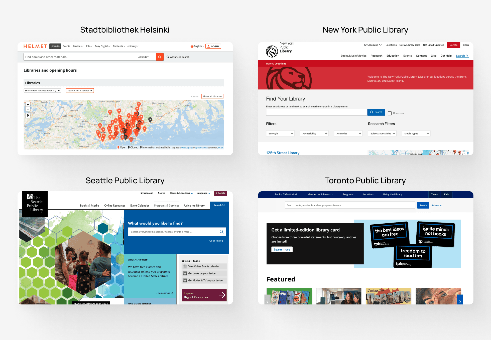
Here are some key insights I gained from the competitive analysis process:

  • Simple, intuitive navigation with clearly labeled menu items

  • Key functions like search, account, and catalog are easy to find and always accessible

  • Search is prioritized and prominently placed across all pages

  • Advanced filtering: by genre, language, availability, format, region, etc.

  • Multiple result views: grid, list, compact list

  • Clear and clean search results: cover, availability, short description

  • Modern, consistent design with good contrast and clear visual hierarchy

  • Use of icons to support navigation and content comprehension

  • Well-structured detail pages: readable, with additional info (author, reviews, awards, etc.)

  • Events and services (like getting a library card) are prominently featured and easy to access

  • Ratings, likes, comments, and recommendations enhance engagement

  • Simple, uncluttered landing pages focused on core actions and content

RESEARCH

RESEARCH

Online Survey

Online Survey

To better understand user needs and pain points, I created an online survey focused on experiences with the Vienna library website. I defined clear research goals, designed the survey using Google Forms, and shared it within my personal network - mainly students and regular library users. The insights gathered played a key role in shaping design decisions throughout the project.

The survey revealed the following insights:

The survey revealed the following insights:

Insights

Insights

  • Most participants use the library website regularly, especially during university semesters

  • The primary use case is searching for media (books, movies, music, etc.)

  • Many users struggle with navigation and finding key content like media, locations, or opening hours

  • Over 60% find the search function inefficient or difficult to use

  • Users report issues with media filtering, search accuracy, and locating specific books or eBooks

  • Layout and structure are often described as confusing and poorly organized

  • Over 70% rated the design as outdated or unappealing

  • The excessive use of red for actions and links negatively impacts clarity and visual hierarchy

  • Users want improvements in search design, menu structure, filtering, and overall visual appeal

  • Around 80% of users feel neutral to dissatisfied with the overall website experience

DEFINE

DEFINE

As part of the Define stage, I created an affinity diagram after conducting an expert review, competitive benchmarking, and an online survey. This step was crucial in organizing and synthesizing all insights into clear thematic clusters. It helped me make sense of the data I had gathered so far - such as user pain points, positive design elements, and key usability issues. This clarity laid a strong foundation for the next stages of redesigning and enhancing the Vienna Library website experience.

DEFINE

DEFINE

HMW - How Might We

HMW - How Might We

To move from identifying problems to exploring potential solutions, I developed a set of How Might We questions grounded in the insights gathered from my expert review, survey findings, and benchmarking analysis. I focused on three major themes: Homepage & Navigation, Location & Opening Hours, and Search & Results - each framed with one to two targeted HMW questions. These helped reframe user pain points into actionable opportunities for design. Including this step in my UX process was essential, as it allowed me to shift from problem identification to solution-oriented thinking. It provided a structured way to stay user-centered and guided the ideation phase with clear design goals in mind.

Homepage & Navigation

Homepage & Navigation

  1. How might we make the navigation and menu more intuitive so that users can quickly find relevant information?


  1. How might we make the homepage and overall experience feel more inviting and engaging?

  1. How might we make the navigation and menu more intuitive so that users can quickly find relevant information?


  1. How might we make the homepage and overall experience feel more inviting and engaging?

Location & Opening Hours

Location & Opening Hours

  1. How might we make library locations and opening hours easier to access and understand for users?

  1. How might we make library locations and opening hours easier to access and understand for users?

Search & Results

Search & Results

  1. How might we improve the search experience for available books so users can find what they need faster?


  1. How might we enhance the search experience with better filters and sorting options to help users easily find the most relevant content?

  1. How might we improve the search experience for available books so users can find what they need faster?


  1. How might we enhance the search experience with better filters and sorting options to help users easily find the most relevant content?

IDEATION

IDEATION

Low Fidelity

Low Fidelity

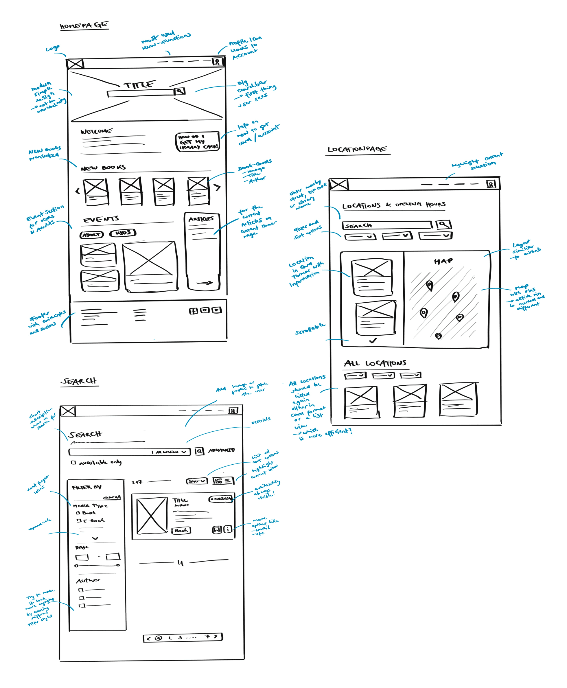
Here are my early design explorations based on the insights and goals identified in the previous phases. The low-fidelity wireframes allowed me to visualize and experiment with layout, structure, and key functionalities of the Vienna Library website. They served as a foundation for testing ideas quickly, focusing on usability and user flow without being distracted by visual details.

IDEATION

IDEATION

Mid Fidelity

Mid Fidelity

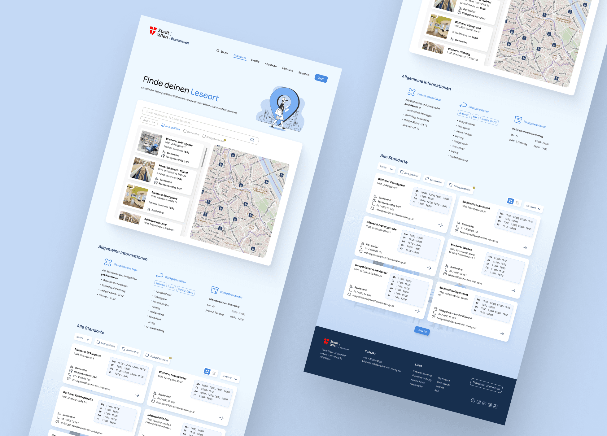
The mid-fidelity designs marked a key turning point in bringing the website to life. With a clearer layout and structure in place, I focused on refining user flows, improving visual hierarchy, and defining how key elements like search, navigation, and filters would function together. This stage was essential for testing usability more realistically - without the distraction of final visuals. It allowed me to evaluate how intuitive the interactions felt and whether users could complete their tasks smoothly, setting the stage for deeper iteration and visual design.

IDEATION

IDEATION

High Fidelity

High Fidelity

Bringing the vision to life, the high-fidelity designs reflect my commitment to creating a visually engaging yet user-centered experience. I focused on blending a clean, modern aesthetic with thoughtful layout and hierarchy - ensuring the interface feels intuitive and easy to navigate. Every detail, from typography to color usage, was chosen to enhance usability without overwhelming the user, resulting in a design that feels both fresh and functional.

Homepage

Homepage

To set the tone for a more intuitive and user-friendly experience, I began by redesigning the homepage - transforming it into a clear, engaging, and welcoming entry point. Every element was intentionally placed to guide users effortlessly and highlight the library’s rich offerings.

To set the tone for a more intuitive and user-friendly experience, I began by redesigning the homepage - transforming it into a clear, engaging, and welcoming entry point. Every element was intentionally placed to guide users effortlessly and highlight the library’s rich offerings.

Clear, standalone login button
Removed confusion by placing a prominent, easily identifiable login button - eliminating the guesswork around account access


Improved header navigation
Separated key menu items as standalone links with clearer naming conventions, making navigation more intuitive and reducing cognitive load


Hero section with prominent search bar
Placed the search function front and center, over a background image of books to immediately establish context and encourage engagement


New “Library Card Help” Card
Added a visible help button guiding users on how to get a library card - addressing a major previous pain point for first-time users

Refined "New Arrivals" section
Gave new media releases a more sophisticated and eye-catching layout to spark curiosity and exploration


Revamped event highlights
Redesigned event previews with visuals, better information, and clear iconography - making them more appealing and easier to understand at a glance


Dedicated news section
Introduced a space for library-related news and updates to keep users informed and connected to current happenings


Showcase of special offers and services
Featured lesser-known yet valuable library offerings at the bottom of the homepage - bringing visibility to resources users often didn’t know existed

Location Page

Location Page

The location page was completely reimagined to make finding a nearby library faster, easier, and more intuitive. Instead of endless scrolling through a basic list, the new design puts the user in control with smart search and visual guidance.

The location page was completely reimagined to make finding a nearby library faster, easier, and more intuitive. Instead of endless scrolling through a basic list, the new design puts the user in control with smart search and visual guidance.

Search-first approach with integrated map
The page opens with a prominent search bar alongside an interactive map, instantly encouraging users to start their journey by exploring visually


Flexible search and filtering options
Users can search by name, street, or postal code, and apply useful filters like district, current opening status, accessibility, and return station availability - making it highly functional for real-world needs


Replaces outdated list-based approach
Shifts from a long, static list to an interactive, guided experience - helping users locate the right branch quickly and with less effort

Improved general information section
Key details like closure dates and exceptions are now clearly presented, improving transparency and reducing frustration


Filterable and sortable library list
Below the map, users can still browse all locations in a modern, card-based layout - with options to switch between list or grid view and sort by relevance or other criteria


Informative library cards
Each library card includes essential details like name, address, opening hours and important information with a touch of relevant icons - giving users a quick and useful overview at a glance

Search Page

Search Page

The search page is a key part of the user experience, as it's one of the most frequently used features on the Vienna Library website. I redesigned it to be more intuitive, efficient, and visually clear - helping users find what they need without friction.

The search page is a key part of the user experience, as it's one of the most frequently used features on the Vienna Library website. I redesigned it to be more intuitive, efficient, and visually clear - helping users find what they need without friction.

Prominent and accessible search bar
A large search field is placed at the top of the page, immediately visible. Users can select their location directly and access a clearly labeled “Advanced Search” for more specific queries


Redesigned filter section
Filters are placed within a separate card layout to avoid clutter. Active filters are shown at the top, allowing for easy removal or adjustments at any time


Smarter filtering options
New filters include availability, publication year (with a user-friendly slider), single media type selection, author filtering, and more - all enhanced with icons to support faster recognition and navigation


Flexible result layout options
Users can switch between grid and list views depending on their preference. A sort dropdown above the results helps organize content by relevance, date, or other criteria

Clear, informative result cards
Each search result is presented in a thoughtfully designed card showing key info: title, media type, book information, availability (highlighted on the side), and supporting options like bookmarking and more actions


Quick-access tools with icons
Useful functions like print, share, or email are now represented as larger buttons with clear icons - making them easy to spot and use


Clean and user-friendly design
The new layout reduces cognitive load, improves scanability, and makes the search experience smoother and more enjoyable for users with all levels of tech comfort

FINAL STEPS

FINAL STEPS

Final Thoughts

Final Thoughts

Working on the Vienna Library website was a rewarding experience that pushed me to think creatively and practically. It was a chance to balance modern design with user-friendly functionality, and to refine my skills in making complex features easy to navigate. The project highlighted the importance of simplicity - sometimes the most impactful changes are the small ones that make everything click. It was a fun challenge to create something that’s not only visually engaging but also efficient and intuitive. This project really reinforced how design is a blend of creativity and problem-solving, and how small improvements can lead to big differences in user experience.

Appreciate the scroll 💫

Contact me

alecpureza@hotmail.com

alecpureza@hotmail.com

alecpureza@hotmail.com